Typographic maps II
Time for a follow-up on a my short post about typographic maps nearly a year and a half ago. Maps made up of type are, as the kids say, the bee’s knees. As typography- and map-based designs are rather popular in general, more of these typography maps crop up every so often. Here’s another short list of some more maps I have encountered since writing last year.
[Update: it’s gone now] typographymap.com has said “We’re launching soon” for two harvests now. I still don’t know what it is, but it’s kind of cool.
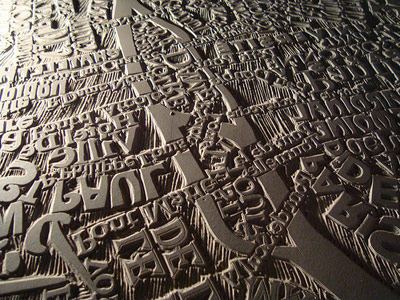
My earlier post mentioned Mark Andrew Webber and his linocut maps, but since then he’s worked on a large and amazing map of Paris, which you’ve probably seen by now. More like awesomecut.
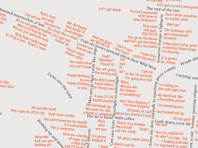
One of my favorite maps from the poster session at this years NACIS conference was Mouths Wide Open by Mike Boruta of Ohio University, mapping Athens, Ohio with things overheard around town as well as his own thoughts. With his permission, here is a larger section of the map. Mike, it must be noted, was the winner of the NACIS student poster competition for a different map, The Million Dollar Highway.
Hand-lettering is not typography of course, but we can be liberal here. Layla Curtis has several drawings of maps that consist, essentially, of labels. I think they are traced. On her site, look for them under Work->Drawings.
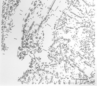
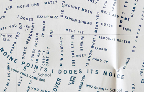
Portsmouth Vernacular by Jodie Silsby is a fabulous map of Portsmouth (UK) with the streets written as local slang phrases. Maps + typography + language? Yes, please!
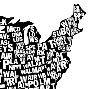
Here’s a series of maps at Very Small Array showing the US with each state filled in by the most common location mentioned in craigslist “missed connections” posts.
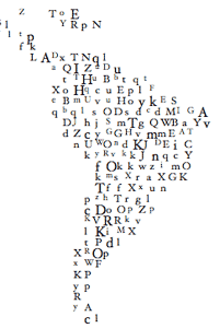
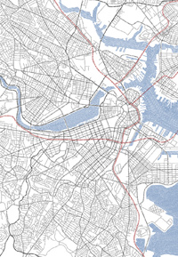
Finally, this is as much as I am willing to show of an unfinished project right now, but here’s a tiny preview of a map I have slowly been working on for a while. For now you’ll just have to take my word that everything besides white space in the image below is made up of type. [Update: it’s more than done now]
Tagged typography

8 Comments