By Andy Woodruff on 20 September 2010
City ≠ city. Place ≠ place.
You know when you’re two thousand miles from home and somebody asks where you’re from and you just name the nearby major city even though you actually live in an adjacent suburb, because who the hell would know where that suburb is? I wish we’d think of cities that way for real, not just occasionally out of convenience.
Let’s divorce the geographical notions of “city” and “place” from the legal definitions. I’m tired of people being so hung up on municipal boundaries when they think of their cities. Tired of imaginary lines on maps, having little or nothing to do with patterns of intraurban human settlement, separating “here” from “there.” Tired of people in my city thinking it functions in isolation from the larger city next door, and of people in that city thinking my city is just some other place, hardly different from a town 80 miles away. In your typical American urban area, instead of a great, proud city I see a bunch of heres and a bunch of theres, each one thinking it’s better than the others. Look at it from afar, or even from a hot air balloon. It’s one centralized urban place. One city. In my hippie dream America we’d know where the lines on the map are (let’s face it, they are of civic consequence) but wouldn’t live by them.
Interesting, then, is that these lines aren’t found in many of the maps we all frequently use now. Google Maps will show city names but not their extents. The new Stamen design of Bing Maps is even more wonderfully ambiguous. Here’s the map I see upon entry, showing where it thinks I am.

I see four levels of place labels, and not all of them correspond to municipal entities. One of the labels is even a place that contains parts of three different cities in three different counties. Most notable, though, is the large, semi-transparent “Boston” label, and I really like the overall impression it gives of the city. I live in Cambridge, which is labeled on the map and clearly is a real place, but its precise definition is unknown, and by the labels it seems to be a part of this greater city called Boston. And that’s just how one should think of the city from this distance.
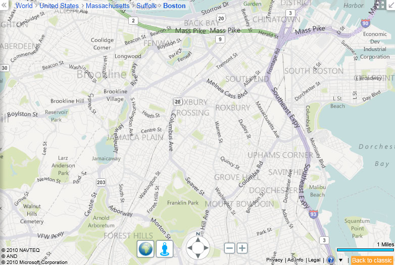
Zoom in a couple of steps and you get a view that is almost officially ambiguous—the ghosted labels name neighborhoods that in my experience don’t have boundaries that any two people would agree upon. (Other cities have more certain neighborhood boundaries, but real neighborhoods are still hard to pin down.) Again the labels do more than allow for display of a hierarchy; they nicely depict the reality of fuzzy, uncertain extents of urban places. In a way, this map is more accurate than one with precise lines. (Bing does show county boundaries, though. Counties are stupid too.)
So here’s to Bing and others reshaping our urban geographical notions. Even if the vagueness is annoying when we wear our Practicing Cartographer hats and are looking for good reference maps.
On a closing note, an excellent attempt to move beyond political boundaries as geographical definitions is the CommonCensus project, which aims to map the spheres of influence of American cities (also sports teams). Have a look at the maps, and please do contribute your response to the survey questions!

Tagged bing, cities, labels, rants, urban geography | 11 comments
By Andy Woodruff on 23 August 2010
I’m very weary of the hipster obsession with zombies by now. Cut it out, hipsters. So I felt shame the other night as my friend and I sprinted through the dark along treacherously uneven brick sidewalks, running from zombies and loving it.
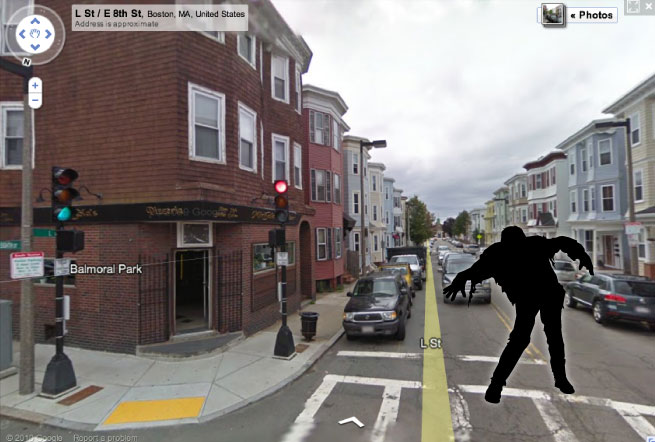
Not real zombies, or even hipsters—we were responding to an awesome app for Android phones called Zombie, Run! It’s a location-based game of sorts that places a bunch of zombies between you and your destination on the map. When you’re near enough to a zombie, it begins to give chase. You must reach your destination without a zombie catching you and eating your brains. It’s lots of fun and can make mundane trips much more interesting, especially if you enjoy running around like a maniac in public.
But a game like this is also fascinating when you set down your can of High Life and put on your Geographer hat. It directs a kind of spatial behavior that technology more often stamps out in one way or another—wandering. While our gizmos usually tell us exactly where something is and how to get there, here is something that forces a person to stray from the direct path. Assuming the player keeps his eyes open and actually notices the world around him, the game provides an interesting way of experiencing and understanding urban spaces. By acting upon virtual landscape in the physical landscape, the player travels unpredicted paths and enters areas that might otherwise never have been seen.
It’s a little like an exercise in psychogeography, a field I can’t really claim to understand but a central activity of which seems to be the dérive, in essence a sense-driven wandering. But here instead of reacting to the sights and sounds and smells of the real urban landscape, a person is influenced by a random set of obstacles beyond anyone’s control. Such randomness may not lead to an especially deep understanding of the city, but its advantage is in ensuring wandering much more free of human biases—perhaps a better sampling of the landscape.
I have a hobby of going on long walks about town in order to check out areas I don’t know well (or at all) and often to capture a photo or three. Most of the time I end up plotting a general route beforehand to ensure that I hit a few key spots and maximize travel on routes I haven’t taken before. Invariably I second-guess myself after the fact. What did I miss by adhering to this route? What made me choose this route? What made me avoid other routes? So recently on what was only my second visit to South Boston, I let the zombies decide much of where I would walk, leaving me with perhaps not a representative impression of the place but certainly the feeling that I got a moderately more real, unbiased look at the neighborhood. Naturally it was an amusing mapping exercise too.
Here is my great Southie zombie adventure. From the point where I switched on the game (A) I had three destinations in sequence (B,C,D). Blue shows the direct route, and red is the GPS track of my actual route.
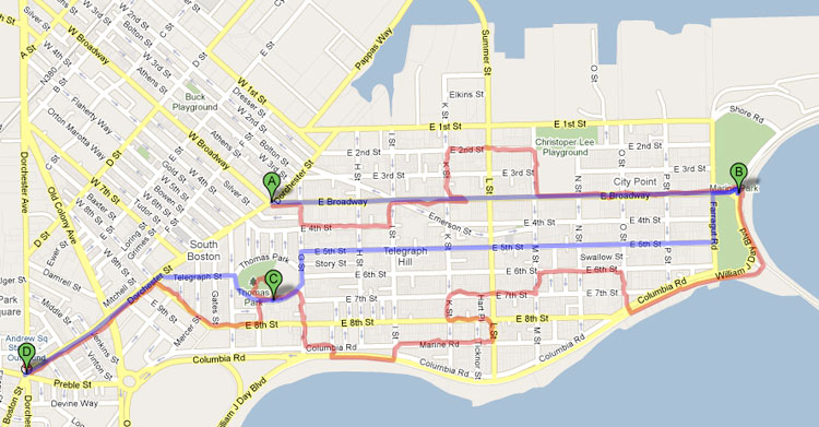
Apologies to any of you fine Southie people I hurriedly brushed past to escape a close call with zombies. Good thing none of you were angry Irish mobsters like in the movies.
Praise be to mobile technologies that promote discoveries of space and place instead of conveniently simplifying them.
Tagged Boston, exploration, psychogeography, urban geography, wandering, zombies | 1 comment
By Andy Woodruff on 20 July 2010

The other day Axis Mapper Dave was working with styled maps in the Google Maps API and made a brief styling mistake—all the small roads disappeared but their one-way arrows remained.
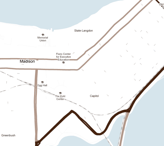
It was actually kind of an interesting perspective on the street system, a stripped-down view of engineered traffic patterns or perhaps a measure of the confusion facing unseasoned motorists. Sure enough that same evening saw me driving in circles because of one-way streets in a place where I’d ordinarily be on foot. And in Madison, Wisconsin, pictured above, in spite of the relatively few arrows on the map it can be surprisingly complicated to cross the isthmus if you don’t start from the right spot. Anyway, with these thoughts in mind naturally I stole Dave’s styling code and tried to blank out everything else to leave nothing but arrows from one-way streets.
Unfortunately it doesn’t seem possible to do this completely with the Google Maps style options, and my samples below involved a little editing to remove yellow streets. I couldn’t figure out a way to make the “arterial” category of streets white without also turning their arrows white. Cloudmade‘s style editor, meanwhile, can do that but can’t yet remove street labels. This bare-bones map is the best I could do with Google Maps; the arterial streets are just turned off entirely, leaving a mostly white-and-arrows map at the largest scales.


Whereas I have previously tried to make a map into a musical instrument, I picture these maps as dance steps. It looks easy to do the Brooklyn, but it’d take some skill to dance the Paris. I’m not about to try it myself, but when geography-based dancing sweeps the nation, I demand royalties!
Pictured at top: dance steps in the sidewalk on Broadway in Seattle, by Flickr user DrewToYou.
Tagged driving, google maps, minimal maps, one-way streets | 3 comments
By Andy Woodruff on 10 July 2010
You know you’re a map geek when you’re at Red Rock Canyon outside Las Vegas, walking across ground that is covered with thousands of stones, and what catches your eye is a single little rock that totally sorta looks like a map of Ohio.
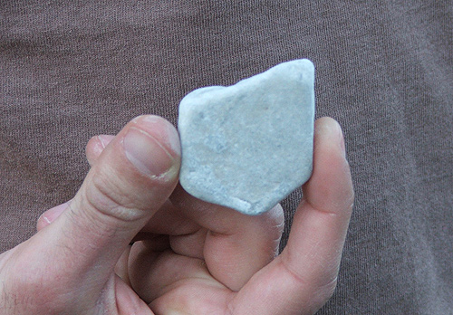
(At the time you’re also wearing a t-shirt with a map of Wisconsin on a cow, obviously.)
Tagged nevada, ohio, rocks | 5 comments
By Andy Woodruff on 22 June 2010
City skylines are one of my favorite types of scenic view. When planning to visit a new city, or even when looking to take some photos of a familiar city, I like to do some online scouting of good spots for a skyline view. I can recall several years ago browsing Google Earth, panning around and tilting the view to see terrain and guess at good vantage points. But by now Flickr users probably have just about every vantage point covered, so a more fruitful search can be done by looking at geotagged photos.
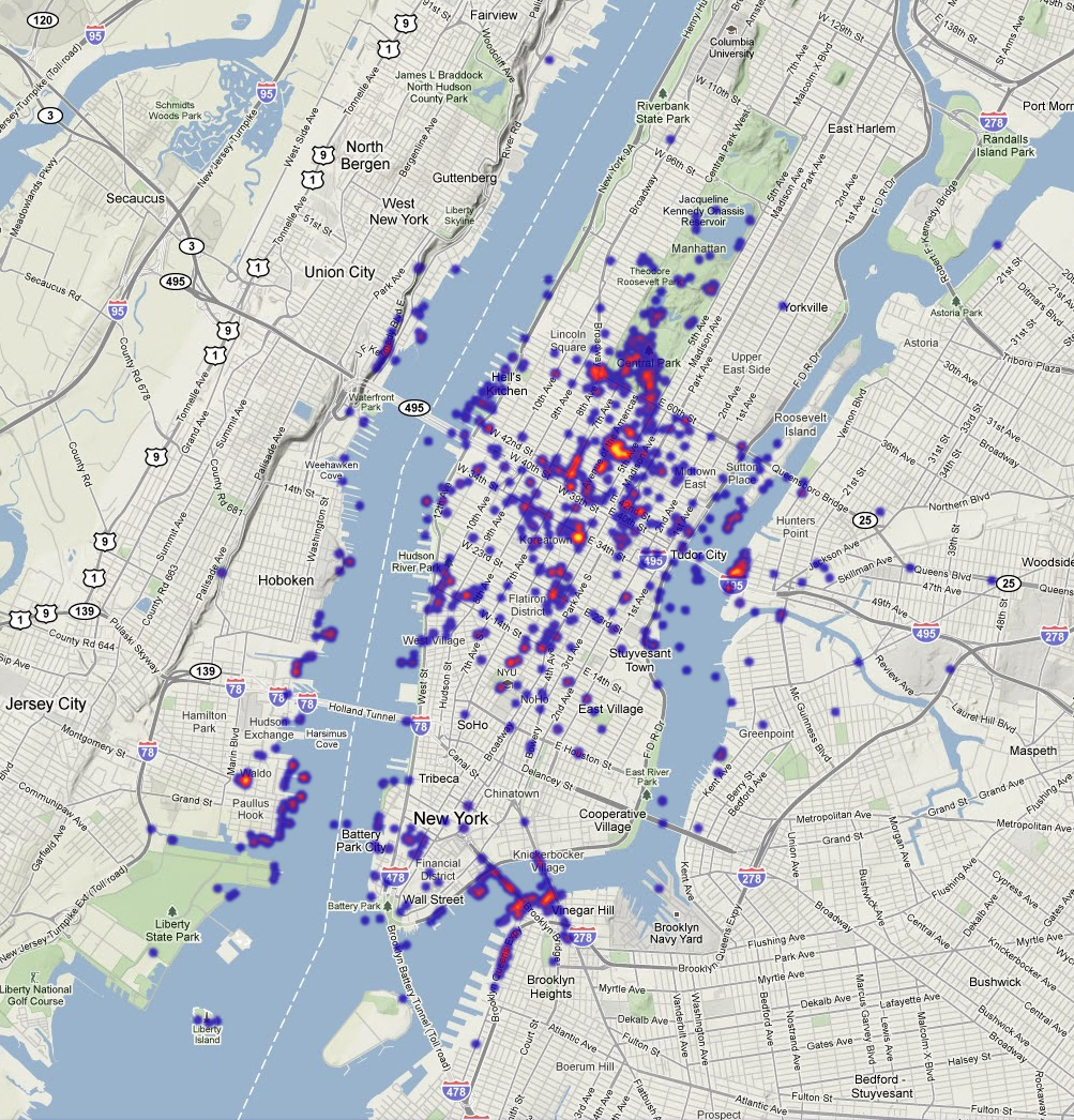
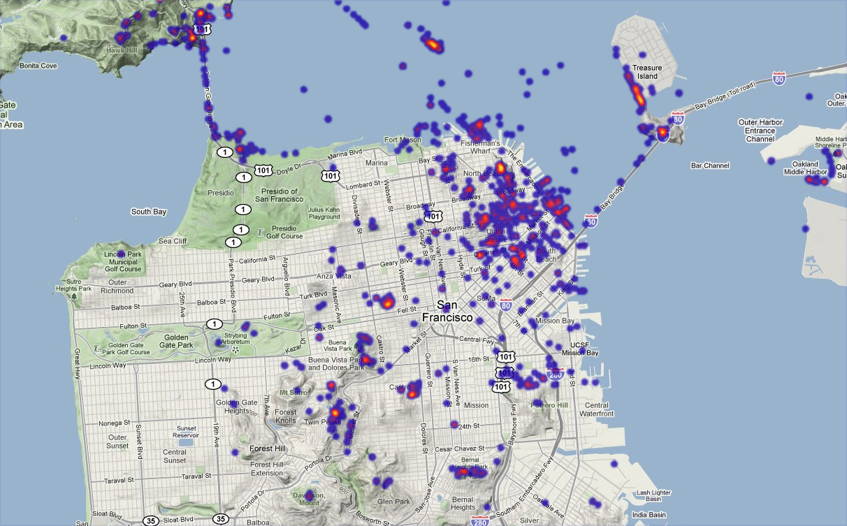
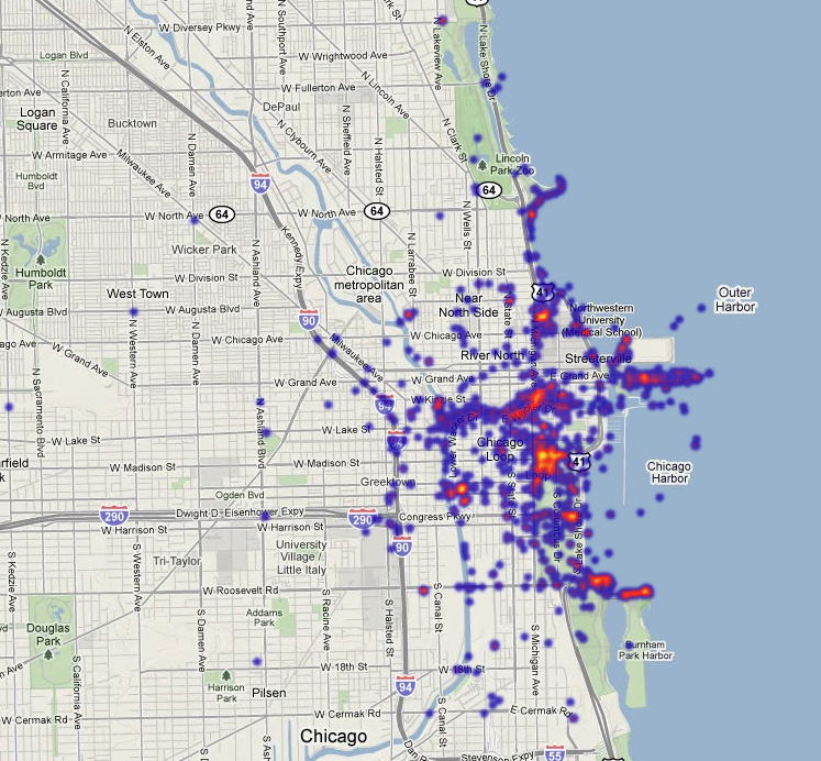
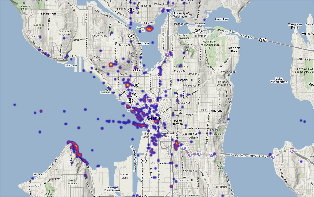
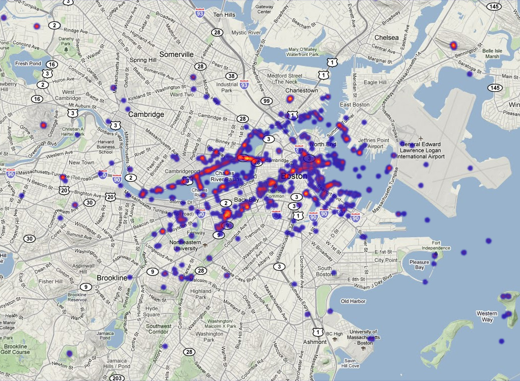
Out of curiosity I threw together some maps to show where most of the skyline views are, as defined by photos tagged “skyline” on Flickr. They are done in a sort of heat map style where brighter red and yellow indicates a higher density of photos, but they are neither real heat maps nor real density surfaces; rather they are many overlapping, mostly transparent dots, blurred a bit and mapped to a heat-like color gradient. There are no great insights that you can’t get from searching Flickr’s own maps, but it’s not bad for purposes like mine. I even learned of a new spot to check out locally; so it totally worked!
Here are some of the most photographed cities in North America, according to these guys. I did skip a few, but they tended to lack enough “skyline” tags to make for an interesting map.
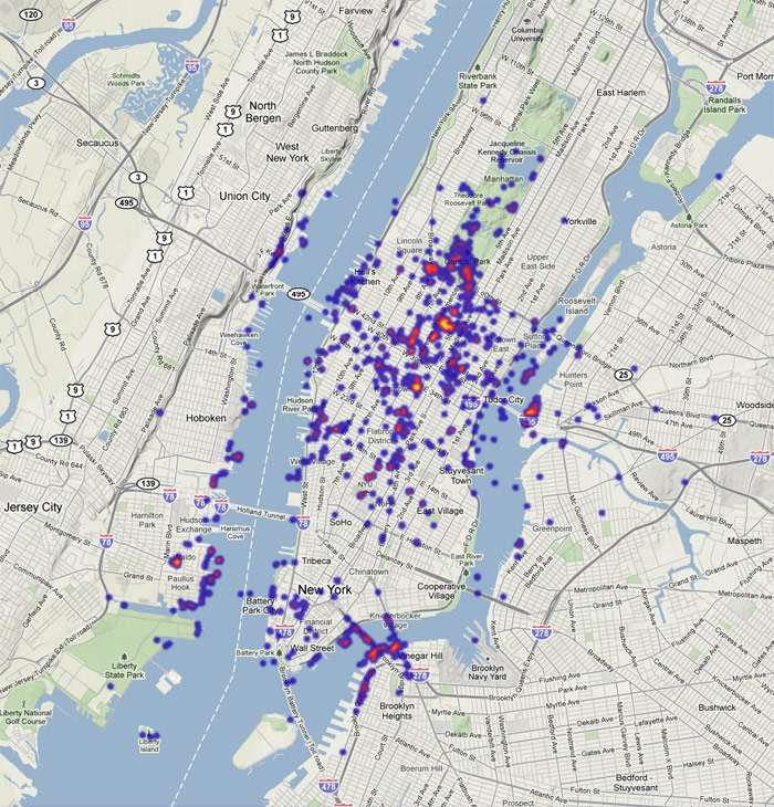
New York: The brightest lights here are observation decks (the Empire State Building and Rockefeller Center), where one can view the skyline from the sky’s perspective. New York has such an abundance of skyscrapers that it’s difficult to take in the whole skyline at once from the ground, but that’s no reason not to see the views that people are favoring along the East and Hudson Rivers.

San Francisco: This city is made for scenic urban vistas. I recognize Coit Tower and Alactraz here, and can see that Treasure Island affords a nice view, but there are also some concentrations closer to the center of the peninsula that are beyond my knowledge of the city.

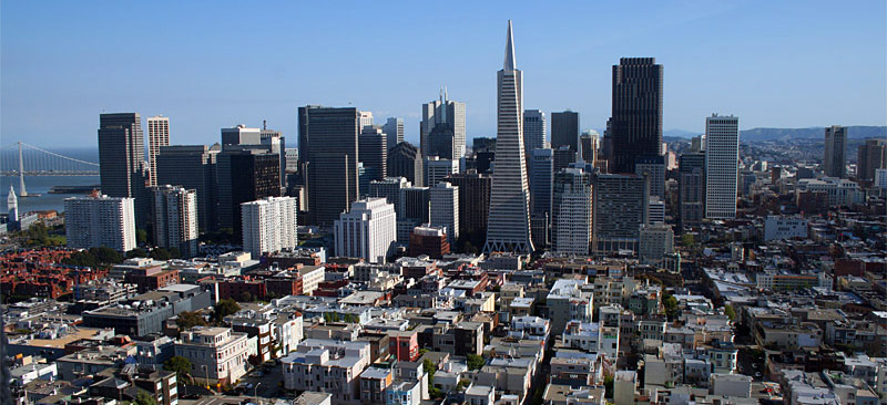
Chicago: All things considered, Chicago gets my vote as the best skyline in the country. There are several predicable popular spots here, such as the Museum Campus, the Sears Tower (or whatever it’s called now), and the John Hancock Center. But most interesting is the hotspot on Millennium Park, and specifically on the Cloud Gate sculpture, a.k.a. “The Bean.” This is presumably one of the only spots among any of these cities where the majority of skyline photos are of a reflection.
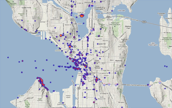
Seattle: Seattle gives San Francisco a run for its money in terms of ideal scenic geography, with lots of hills and coastline. Head to Gas Works Park, the Space Needle, Queen Anne Hill, or, um, that area along the water to the southwest whose name I don’t know. Interesting to note here, as well as in San Francisco, are series of photos that follow ferry routes.
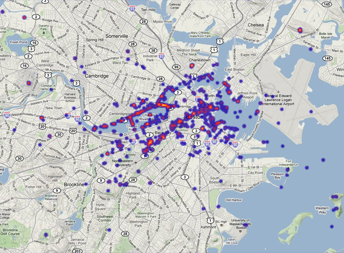
Boston: It’s a difficult skyline, with the two tallest landmark skyscrapers being in an otherwise smaller section separate from the main downtown skyline. Nevertheless there are views to be had. The Prudential tower and the Longfellow Bridge stand out the most here, the latter probably because its panoramic view is so often seen from subway trains coming up for air as they cross the river. Looks like people aren’t fully appreciating the glory of the BU Bridge, though.

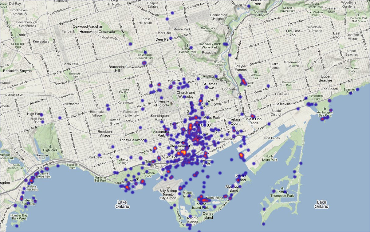
Toronto: Toronto’s skyline has the privilege of being visible at great distances across Lake Ontario. Locally, though, the CN Tower is brighter than anything else on this map, but there are also some notable spots along the water’s edge in various locations. Of all the cities here Toronto is probably the least familiar to me; perhaps some readers can identify locations on this map.
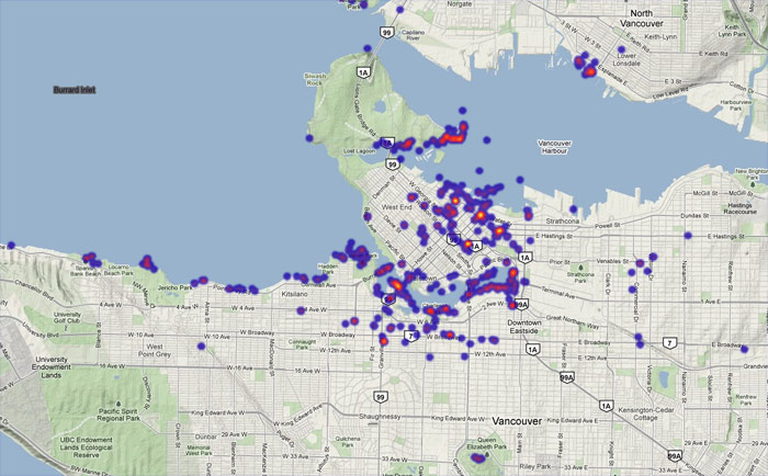
Vancouver: My recollection is that Vancouver’s skyline is expansive but not terribly distinctive. But like the other west coast cities, its topography and coastline provide vantage points. The brightest points on the map are actually on land near the downtown area, but views across various water features prevail overall. I know the Stanley Park views and a couple of those to the west, but am otherwise unfamiliar.

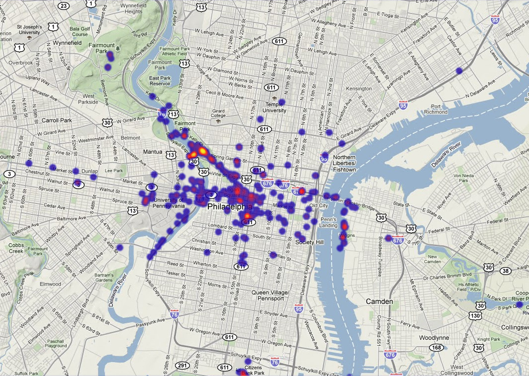
Philadelphia: Of course the favored view is the one from the art museum, and of course all those photos are of somebody doing a Rocky impression.
Tagged Boston, chicago, cities, flickr, new york, philadelphia, san francisco, seattle, skylines, toronto, vancouver | 11 comments
By Andy Woodruff on 16 June 2010
Geometry riddle: When is a square not a square?
Answer: When it’s in New England.
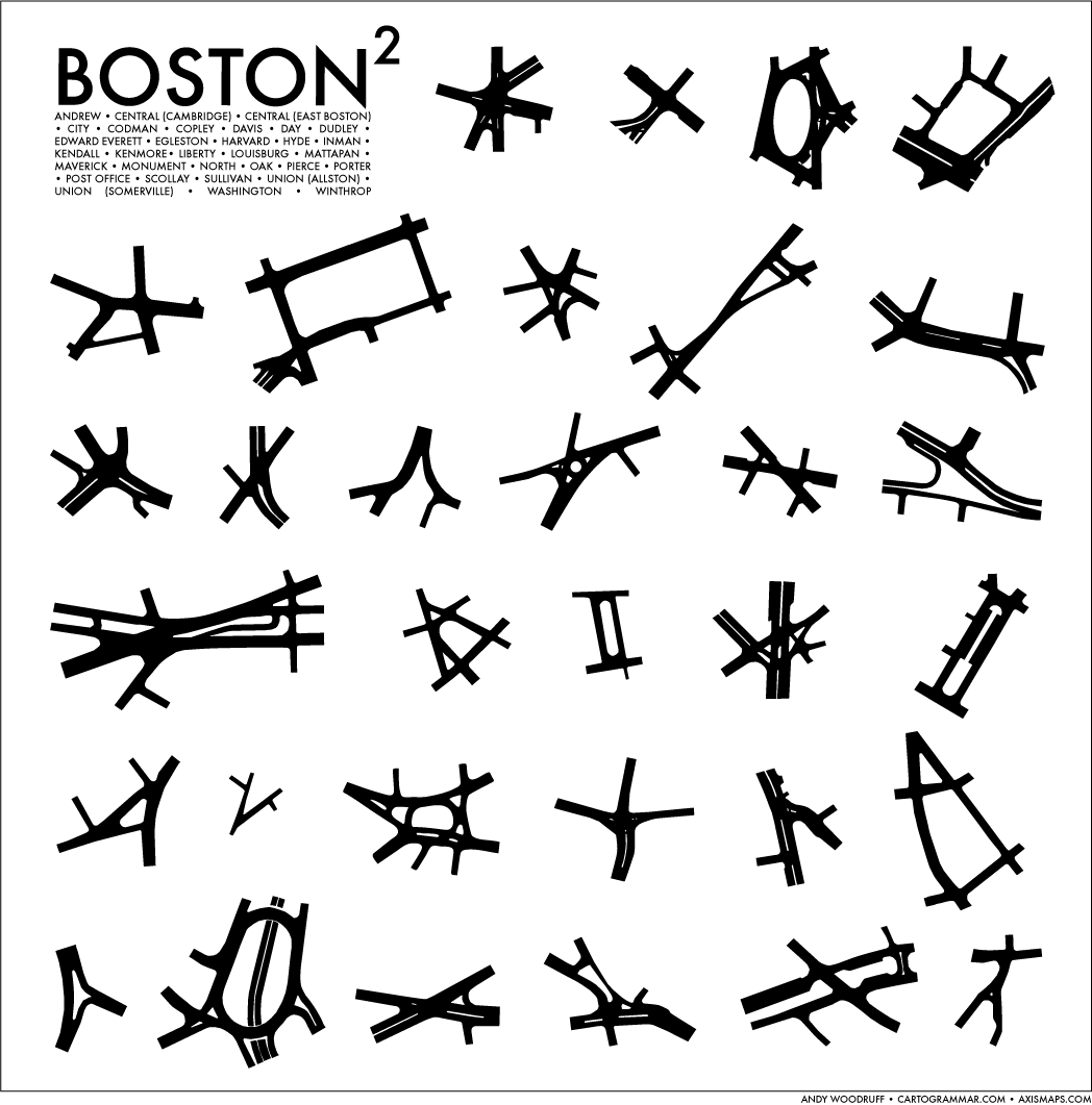
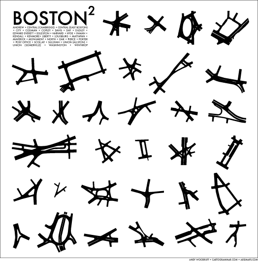
Above (click for greater bigness) with the stupid title is a series of minimal street maps I traced to show the varied actual shapes of a selection of so-called “squares” in the central Boston area. Urban spaces come in all shapes, as you can discover with this nifty tool, and a city square in any part of the world is by no means guaranteed to be a literal square, but New England’s style of square is peculiar (at least in this country) in its especially confused geometry. Unlike many places where a square is most often defined by a public open space or civic structure, here a square is typically defined by an intersection of two or more—usually closer to 4 gazillion—thoroughfares and/or other streets. The square’s name further applies to a business district around that intersection, and sometimes to an entire neighborhood. Thus the squares strongly define much of the local geography and organization of Boston and its close surroundings, as you can see in the diagrammatic Unmapped Boston poster. They are many things, but rarely are they square. You’ll also find some Circles and Corners around town, but they tend to be a bit more true to their names.
Any locals out there can probably find fault with my selection here or with the extent of the individual square maps, but I’ve tried to capture the central intersections of many of the major players. The collection can always grow! Entertain yourself by trying to identify each square before consulting the list under the title. (Squares from Boston, Cambridge, Somerville, and Brookline are included.)
To everyone else: Sorry, I know you don’t care. But this city is just so mappable! (And in a way, undermapped.) You should come visit.
Previously: Squares can also be difficult to drive through, and they make good logos.
Edit: don’t hate me for this, but I’m in experimental stages of posting junk like this for sale at Zazzle, just in case anybody takes pride enough in their squares to put this on a t-shirt or poster. Something more professional and less desperate-looking will occur over time!
Tagged Boston, minimal maps | 16 comments