By Andy Woodruff on 26 April 2011

(This is pretty much cross-posted from the Axis Maps blog.)
Just a quick promotional note in case I still have a remaining shred of dignity: a couple of weeks ago the fellas and I at Axis Maps launched a new store with two new typographic city maps. The Washington, DC map depicts most of the District with some surrounding areas, and the New York City map shows the whole of Manhattan as well as sections of adjacent boroughs and New Jersey cities. We’ve set up our own operation now and are stocked with offset prints, having graduated from Zazzle.
For a brief period there was also a limited edition letterpress print of San Francisco. It sold out in a few hours, much to our delight, but we’re currently thinking about future letterpress runs of this and other cities.
So in summary: now available are new typographic maps of New York and Washington, and all the rest (San Francisco, Chicago color and black & white, and Boston).
Tagged axis maps, typography | 5 comments
By Andy Woodruff on 20 April 2011
The other day Tim Wallace provoked a bit of Twitter conversation about the role of art in web cartography by way of a snarky, pessimistic Venn diagram on the subject; and having been forced into spelling out some of his thoughts in more detail, he has solicited some of us other nerds to write our points of view.
I cracked a beer and started to outline some points in response to Tim’s post but decided it wasn’t worthwhile to attempt to talk about the finer points. Everything hinges on people’s differing definitions of “art.” I ended up progressing through three stages of thought on art and science in web cartography, presented here with sweeping generalizations, ridiculous exaggerations, offensive assertions, and my dumb versions of Tim’s original diagram. (Do read his post first.)

There is plenty of art and science in web cartography.
They’re just not in the process of cartography where Tim was mostly looking. In terms of aesthetics, web cartography is just as capable of being an art as anything; it just, as always in history, is accomplished with the latest tools. But if art were only a matter of aesthetics, the “my five year old could paint that” genre wouldn’t exist. Art is not necessarily in the map itself, nor its execution, and neither is science. During a moment’s break from his one million word dissertation, Robert Roth suggested to me these definitions of art, science, and cartography (in terms of ontology and epistemology, as academics are required to do):
Cartography is the art and science of mapmaking and map use.
Under this definition, mapmaking and map use are the ontologies; they are the bodies of knowledge to which academicians contribute and from which mapmakers and map users draw. These corpora clearly overlap, particularly in the case when map user is mapmaker. Art and science are the epistemologies; they are the ways of knowing or the methods of constructing new knowledge about how maps can/should be made or used.
I can get on board with that (although that language implies to me that pretty much anything is an art and science) if we want to get too philosophical to bother arguing over anything, the eventual point being that all this is at a different level from the actual act of designing and making a map, and that in this there is probably no difference between web cartography and any other cartography. To be a litte more down-to-earth, though, I won’t hold such a fundamental view of art and science, and would generally consider them to include the knowledge itself. The science is, say, How Maps Work, and it, along with whatever art is, informs and guides map design, on the web or anywhere else. But this assumes that “web cartography” really is like cartography as we usually know it. Maybe it’s not.

There is neither art nor science in web cartography.
This is the first of two rude things I will say: web cartography is unartistic and unscientific. The common “cartographer” on the web is either a machine or simply the final human element of everything that goes into a map—the mapmaker. The word itself doesn’t seem as common as it used to be, but the mash-up is still the heart of web cartography. The web map, in my mind, is all about combining your data with someone else’s base map, or your design with someone else’s data, and so on. When I make a map by coloring a bunch of polygons on top of Google Maps, have I done anything artistic or scientific? Art and science entered into the equation somewhere along the line (say, when Google designed their map tiles), but it probably wasn’t at my stage, and I’m probably (definitely) going against some good judgments that would follow from them. Despite all the good, artistically brillant and scientifically sound design out there, “web cartography,” if you ask me, is about the retrieval, mingling, and dissemination of data, at times almost willfully at the expense of cartography’s artistic and scientific roots. Web cartography is not about maps; it’s about hacks for moving data around. But hey, most of the time that’s just fine.

Who cares?
Having stated the above two perspectives, rude statement number two: so what? To even fret the “displacement of art” in web cartography (to quote Tim) is to be a traditionally trained cartographer grasping at relevance in the modern world. I like to take this cynical view often (recognizing that I too am just such a cartographer, but at least being real about it) when I see some of my ilk talking about the current wave of amatuer, so-called neocartography, typically to explain why it’s all badly designed or simply wrong. Web cartography, I generally hold, is what it is, gets the job done, and will evolve into something that incorporates the best of art and science. But I admit that it’s hard not to be bothered by moves in the wrong direction. “Art” being nigh impossible to definitively identify, I’d more point to science as the thing being marginalized in web cartography. Take, for example, the bit of excitement seen on Twitter the other day over a Where 2.0 workshop on Google Fusion Tables, which make it easy to load data into what is apparently being called an intensity map. Here is a deliberate advancement in the creation of what cartographic science would deem, well, bad maps. (Inappropriate map projection, a confusion of semi-transparent colors and basemap details, &c.) We do what we can with the technology available and that’s fine, but at some point we’ll have to make the transition from developing technology that makes what we are doing easier to developing technology that makes what we should be doing easier. Perhaps I’ll choose to care this time.
– – – –
Other writing in this inter-blog series: Tim Wallace, Daniel Huffman, and hopefully more to come.
Tagged art, rants, science | 4 comments
By Andy Woodruff on 14 February 2011
A year ago I fired off a quick post with a world map in the Werner projection, which of course we all know is heart-shaped and the ultimate expression of love. In the hopes of establishing a stupid annual tradition, I wanted to do another map this year, and after concluding that simply projecting or arranging maps into heart shapes has been played out, I decided to work for it this time.
Let’s cut to the chase. I traveled a path around town in the shape of a heart as best I could. It was 10.44 miles (that’s 9,872 smoots in the local system of measurement), and the reason it’s awesome is that part of it was on a boat. The GPS track became this sickly shape—not exactly an ideal heart but vaguely recognizable as one. Or at least some kind of pointy muffin. [Google Maps link]
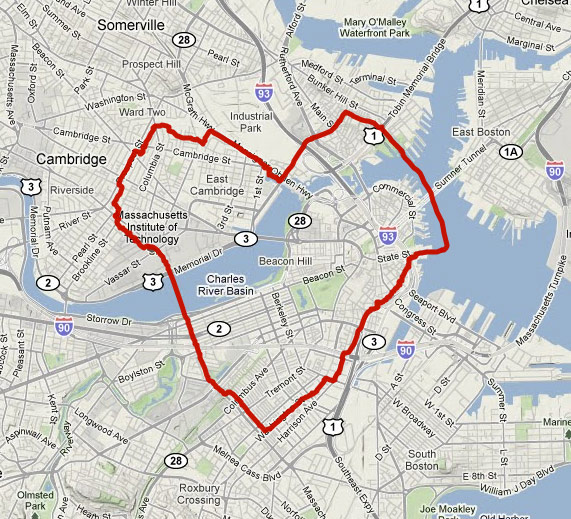
This is my first foray into GPS drawing, and I certainly don’t expect to reach, say, Jeremy Wood‘s level of mastery of the art. But it’s not so much about the art; while this is indeed an attempt at a silly Valentine’s Day map, it is also an exercise in what has been my Cartographic Purpose lately. More and more what interests me is the idea of maps as drivers of activity in physical spaces, particularly as it relates to exploration and discovery in cities as well as personal construction of place and mental maps. My zombie and personal mapping posts touch on this—the map represents in its ordinary capacity the real world but in another capacity a fairly abstract, meaningless space that is acted upon in the real world. So I am driven toward or away from a place not because of what is actually there, but because in some virtual space it contains a zombie or because it is a blank spot on a map of lines or because it happens to be within a heart shape on a street map; and then I discover what is there. Some day when I collect my thoughts and do some more background research I’ll write more about this practice. For now suffice it to say that I am fascinated by this method of discovering and creating place.
For the actual report on this heart excursion you can check out my Bostonography blog post, as they are probably too Boston-specific to address in any detail here. Except this one. Yes sir, mister billboard!
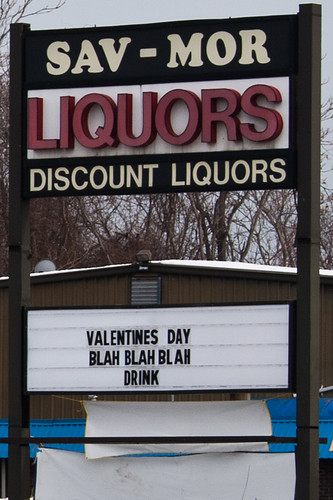
(As long as I’m tying all this into older posts, remember that city boundaries are stupid. This liquor store is in a border zone and I am really not sure which city it’s in. Could easily find out, but now I refuse to.)
Tagged Boston, gps, place, valentines day | 8 comments
By Andy Woodruff on 30 January 2011
Daniel Huffman, whom you already knew from the map critique blog Cartastrophe, got a lot of press recently for his excellent Twitter profanity map. This is the beginning of him increasingly revealing to the world what those of us with the fortune to know him offline have known for a while: he makes lots of awesome maps.
His latest project is a series of maps of river systems done in a Beck-ish transit map style, a highly appropriate and even somewhat useful design for what are, after all, linear networks. He began with the whole Mississippi River system and is expanding into smaller regional maps, having completed Michigan, Southern New England, and Northern California so far. The results are attractive and for sale to satisfy our bare walls.
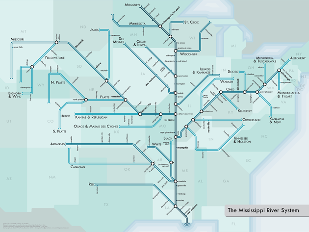
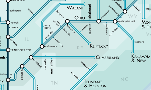
Meanwhile, Daniel has also started a map design blog, where among other things you can read about the design details and process behind these cartogram-like river maps.
One last link: now that his Twitter map is out there, he’s actually been persuaded to join Twitter (@pinakographos), if you need another map person to follow (and you know you do).
Tagged huffman, rivers | 2 comments
By Andy Woodruff on 11 January 2011
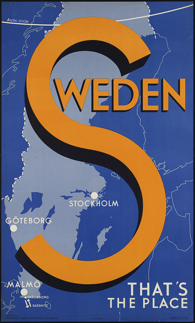
I was thumbing through the Boston Public Library’s Flickr photos the other day and revisited their set of old travel posters, some of which had been on display in a nice exhibit at the main library recently. BPL has some 350 of them, and they’re pretty great. I usually leave the sharing of interesting map links to other more reliable bloggers, but these were shiny and distracting, and I just wanted to make sure we all knew to look at travel posters for our carto-fix.
Here are most (but not all) of the map-based travel posters from the Flickr set. Click them to visit their respective photo pages, where you can see them in larger sizes.
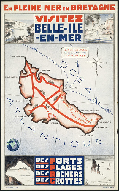
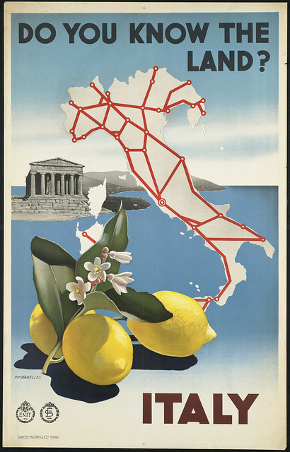
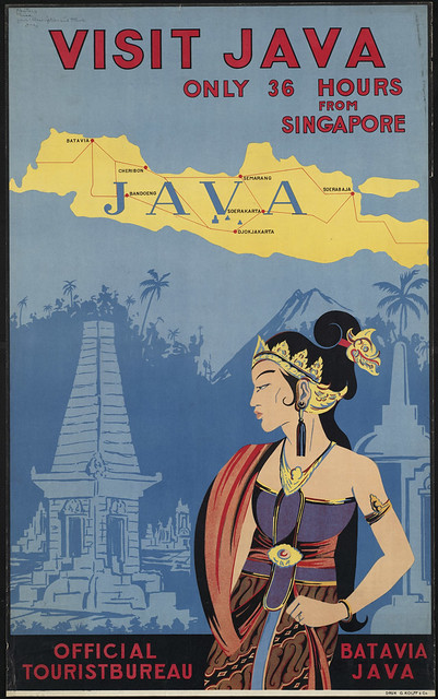


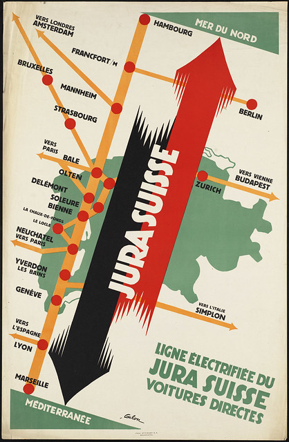

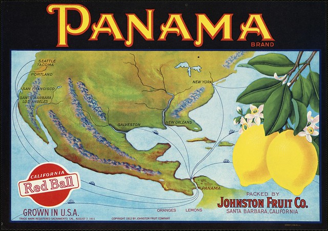
Bonus: produce crate labels!
Incidentally, as the true map geeks out there surely know, BPL also has an excellent map collection, with many maps viewable online through their own site as well as Flickr.
Tagged bpl, tourism, travel posters | 5 comments

