Maps make the best logos
I don’t technically have any authority on the subject of logo design, but that won’t stop me from declaring that maps always—always—are the correct choice for logo designs. So while I attempt to cook up some more interesting projects to post here over the holidays, I leave you with this, my favorite logo lately:

That’s the logo of DARBI (the Davis Square Area Resident-Business Initiative), representing Davis Square in Somerville, Massachusetts. I moved to neighboring Cambridge several months ago and have become very aware that surface thoroughfares in Boston and environs are not long, continuous paths but rather connections between various neighborhood centers, whose central intersections often have a “Square” name. Most commonly, however, these “Squares” are nothing like that shape but instead are (as I am wont to describe it) clusterf***s of multitudes of one-way streets converging in a single spot. By car it is easy around here to travel between squares, but through them is another story entirely.
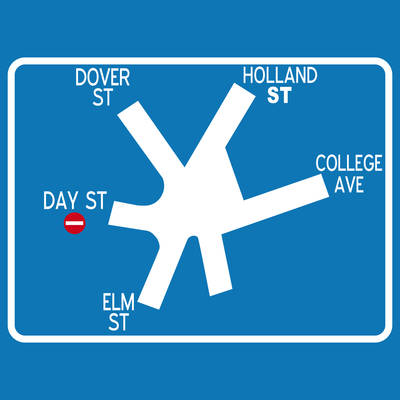
Davis Square (map) is no exception. But what is an exception is the attempt to assist motorists with this sign on approach to the intersection:

It’s a nice, simple map to help you quickly make sense of your five choices at the intersection. That map itself is something of an icon*, but the DARBI logo takes it a step further, stripping the map of its identifiers of map-ness.** That’s when a map logo achieves perfection in my eyes. It’s like a secret wink to cartographers; you’ve got to be one to realize that you’re actually looking at a map. Not true, I know, but sometimes you look for ways to make your line of work seem special.
* Via Boston Coasters one can purchase a number of items featuring that image (which is from B Beaucher Studios, to give credit). By the way, I highly recommend the Boston Coasters/Ward Maps store near Harvard Square (or online) for lots of stuff with cool maps and images of that ilk as well as old maps.
** And turning it into a friendly creature whose smile assures you that even if you get hopelessly lost attempting to navigate the square, it’s okay, because hey, you’re in wonderful Davis Square now, and by the way, next time you should probably just take the T.
Tagged Boston, interesting maps, logos
