In the spring of 2023, I had the honor of being the inaugural "designer-in-residence" with the Leventhal Map and Education Center (LMEC) at the Boston Public Library. Although the LMEC is perhaps best known for its map collections, it's also an institution that supports modern cartography, digital tools for working with historical maps (see Atlascope), and—as its name indicates—education about maps and geography. They devised the four-week designer-in-residence position to further their modern cartography goals: in part, simply to provide material support for living creative cartography, and also to generate new maps to add to their collections.
The only defined goal of this fellowship was to produce at least one map that was a creative response to the theme of "urban atlases" (think Sanborn fire insurance maps) that were the theme of the LMEC's public exhibition in the first part of 2023.
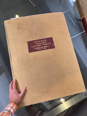
An urban atlas. They're big!
After spending the first couple of weeks looking at maps from the collection and brainstorming, I ended up making two things. Although they don't quite meet some of the goals I had come up with, they were fun to make, and I hope that they both still work as some kind of thinkpiece. Read on for a few details, or see a short interactive tour on the LMEC website.
Some early "sketches" that I didn't pursue further.
A historic-style map of a moderm risk
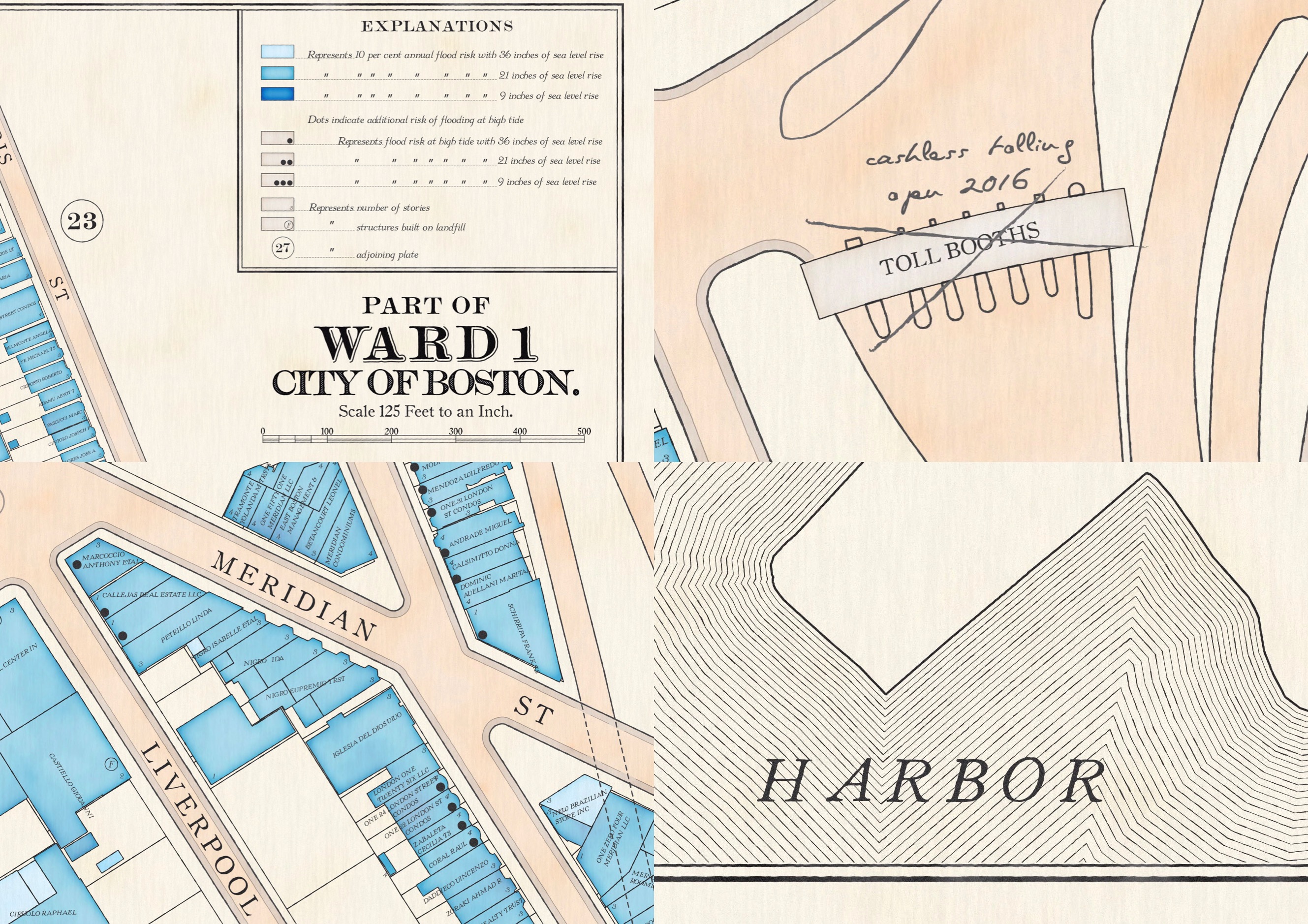
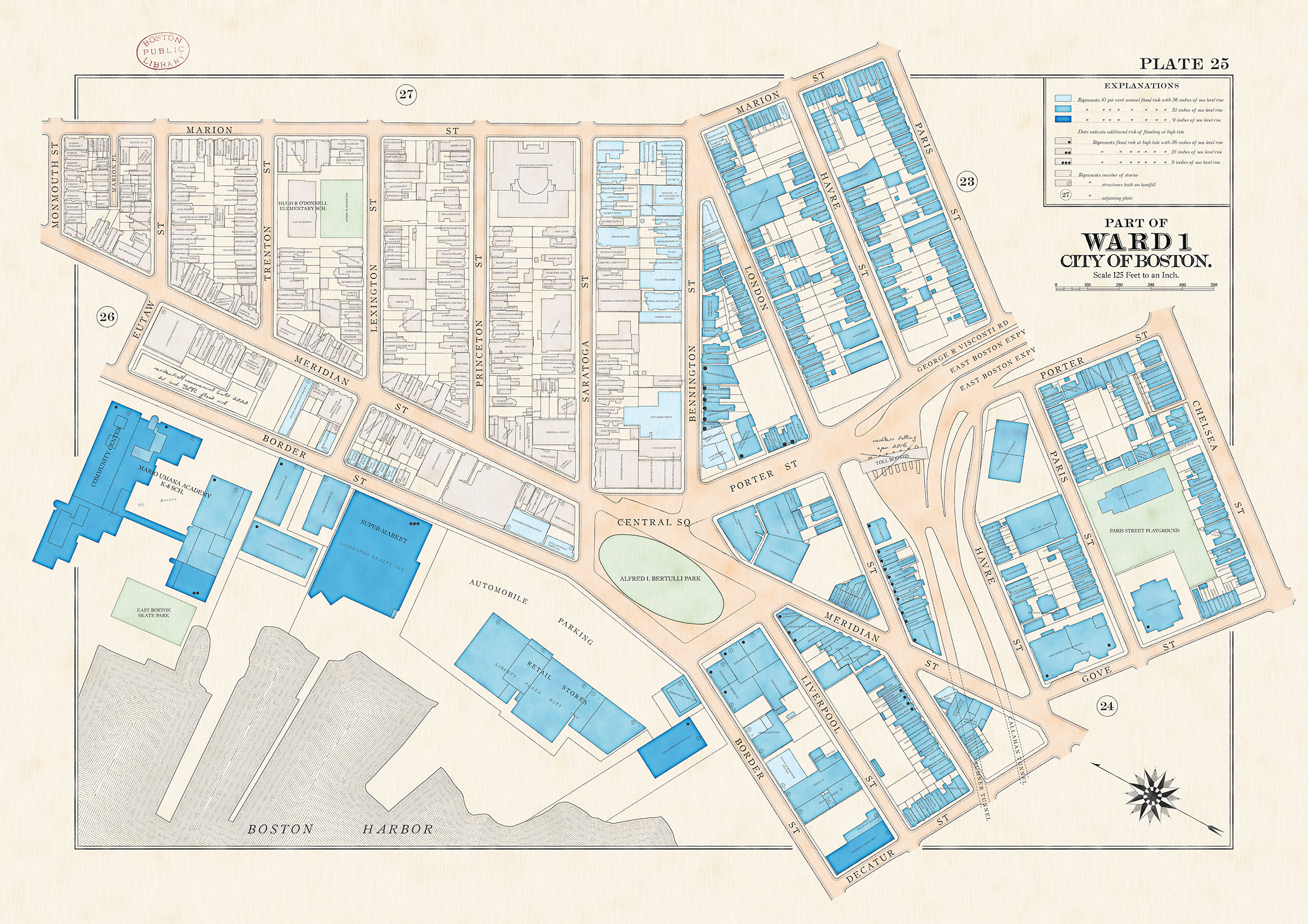
All along I'd been interested in making a modern map had the same captivating style and detail as the older urban atlases, and as I recall LMEC president and head curator Garrett Dash Nelson planted the idea of also mapping a modern risk—the atlases were largely maps of fire risk, after all. The result here imagines a single plate (i.e., map) in an atlas of Boston depicting the modern (future, even) risk of flooding from sea level rise, according to Climate Ready Boston studies. It's meant to be printed at a large (A1) size, similar to the size of an actual two-page spread in an urban atlas.
Instead of coloring buildings by construction material, as the urban atlases often did, colors represent flood risk under several scenarios of sea level rise. In the slightest nod to the many, many symbols in Sanborn maps, buildings also have additional marks if they're at risk of tidal flooding or were built on landfill, as large chunks of Boston are. I had fun here using and expanding the set of tricks I've learned for faking an antique map, adding little imperfections that would come from hand-drawn techniques and from natural aging. My favorite are the penciled-in annotations and corrections, which you'll find often enough in actual atlases as a way to keep them up to date.
A modern map of a historic subject
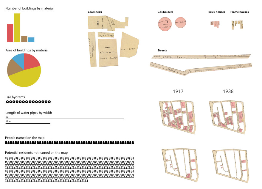
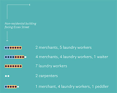
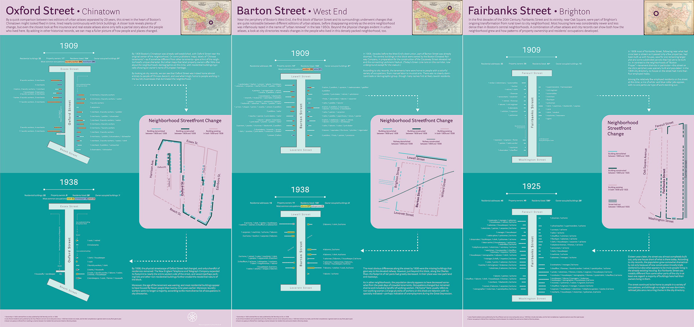
The second product of my time is a set of three prints that are part map, part infographic. Instead of being concerned with the visual style of urban atlases, these try to abstract a summarize a bit about the urban lanscape and people whose stories are hinted at by the atlases. I looked at three residential blocks in different parts of Boston and compared them between two different years, decades apart, for which there were editions of Bromley atlases. I mapped which buildings in the neighborhood had come and gone over those years, in a style that emphasizes how the streetfront had changed, were you to walk around at those different times.
Although labels with property owners and institution names give some small clue about the people in these neighborhoods, residents are mostly absent from the atlases, especially in tenement neighborhoods where owners did not live in their properties. I turned to city directories that listed adult residents and their occupations, matching them to the maps to see who lived in these neighborhoods, what they tended to do for a living, and how the residential character of the areas changed over time.
In parting
I could go on, especially about the first map, but will end by pointing you to my maps in the Leventhal Center collection, where you can view or download them in high resolution (along with maps I submitted to a previous exhibition). So if you want to see all the pseudo-antique effects in full detail, head there!
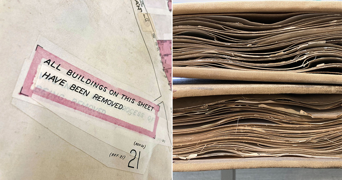
A favorite fun fact I learned: Sanborn maps were kept up to date with literal pasted-over corrections (left), leading to fun warped and wavy pages as they were loaded up with glue and extra paper.