In November 2023, since I had some time to spare, I participated in the 30 Day Map Challenge, an annual event started by Topi Tjukanov in 2019. I did this as an opportunity to try to learn a little something new with each map. Usually, that meant getting more familiar with the capabilities of QGIS, especially for complex and interesting visual styles. The full set of my maps is in a Mastodon thread. There's no need for me to talk about all of them, but as a kind of portfolio entry, below are a handful of my favorites from the month.
1. Points: "Points of Massachusetts"
Mapping places with "point" in their name was a popular approach to this theme. This series of maps for Massachusetts was my use of the QGIS Atlas feature, which is pretty great! With only a little bit of styling and configuration work, I clicked a button to generate 289 maps within a minute or so.
3. Polygons: Polygons of Boston
Places around the Boston area with a polygon in their name, per OpenStreetMap data. As far as I can tell, this means square (very common), triangle, or quadrangle (I counted "quad" too). I mapped grid cells that contain one or more of these places. This was an exercise in spatial joins using QGIS virtual layers, and again in developing a hand-drawn style.
4. A bad map: 100% mislabeled
As Daniel Huffman has written, it's easy but a bit cruel to use "bad map" day to make something ugly or with the wrong map projection or something. Indeed, I wanted to make a map that was "bad" not because it looked bad, but because it was undeniably wrong. I grew more ambitious along the way, first wanting to do a simple map of Ohio but label it as Massachusetts, and ultimately going for something that looks pretty nice but is 100% incorrect in its labels. (Basically a matter of labeling each feature with the name of a random different feature in the layer.)
6 and 8. Asia and Africa: elephants
I grabbed species data from the IUCN Red List and wanted to map the distribution of species with "Asian" in their name, but I lacked the time to find and/or understand a data source with common names to join to it. So I picked one species, the Asian elephant, and tried to have fun coming up with a point pattern style to map its status. (These are indeed pattern fills, not an actual point grids.) Then, for Africa day I more or less repeated the idea with the two African elephant species.
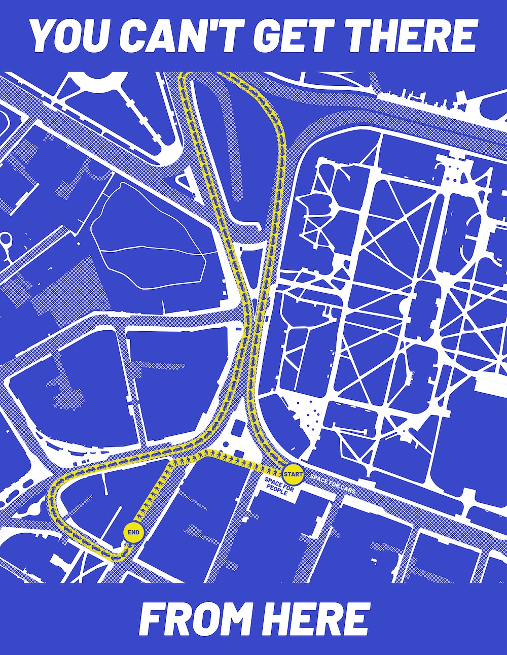
7. Navigation: You can't get there from here
Years ago I made a series of "you can't get there from here" maps showcasing the circuitous routes often needed to travel short distances by care in the Boston area. (And had a version published in the Boston Globe!) One of them was in Harvard Square; here I made a new map of that same place, getting ever so slightly bold with style.
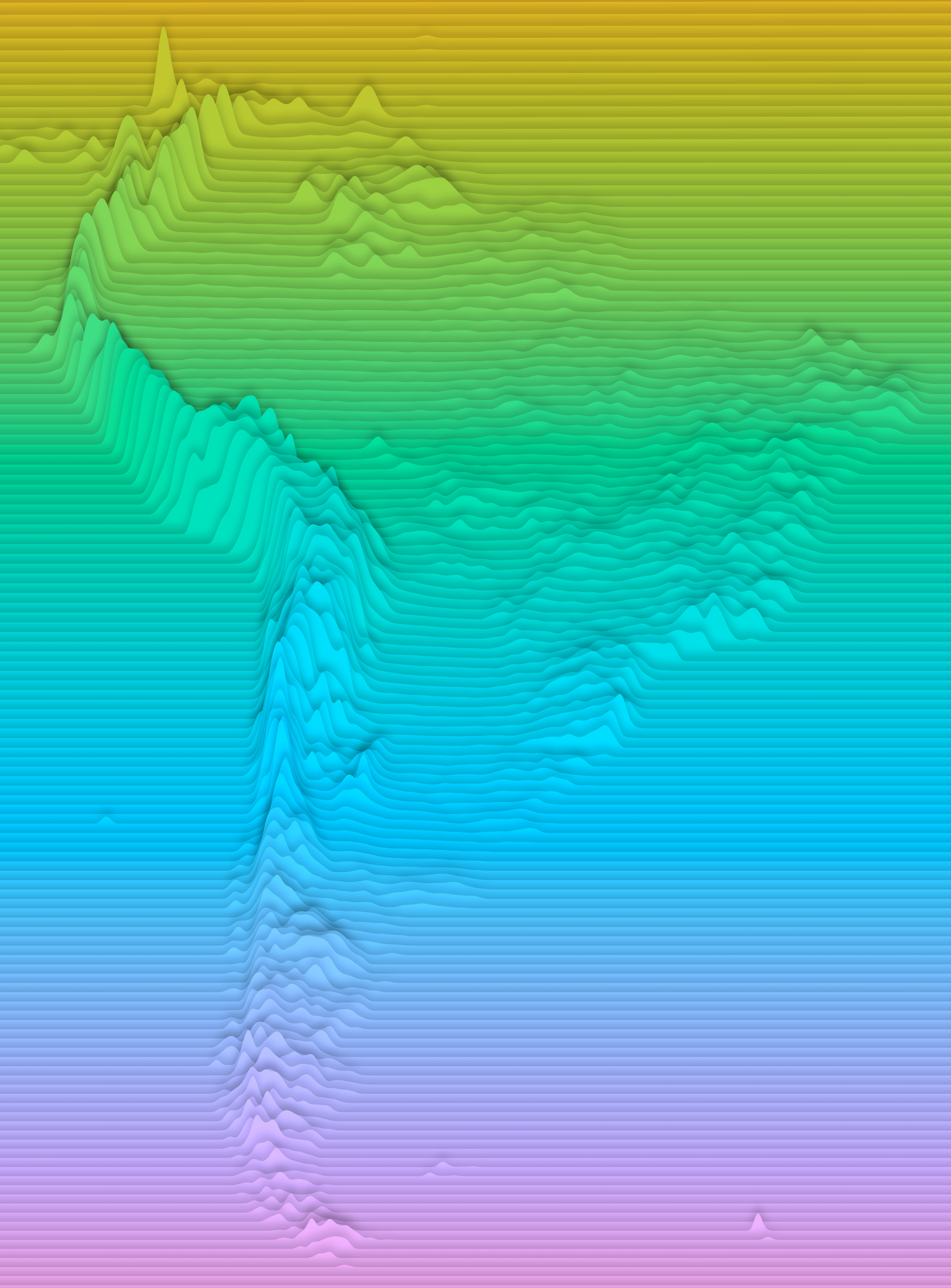
10 and 12. North and South America: Elevation profiles
Elevation profile maps periodically seem to be popular (they're stylish!), and you can find good tutorials for them, such as this one using QGIS and another using QGIS and R. I've had my own code for this kicking around for a while, an offshoot of my many explorations of terrain representation, so I took an easy approach to both the Americas and fired off a couple of images. I've played a lot with styling, as you can probably tell, but also with some scale options in an attempt to create some perspective, as well as offset size distortions—these are all derived from web Mercator map tiles!
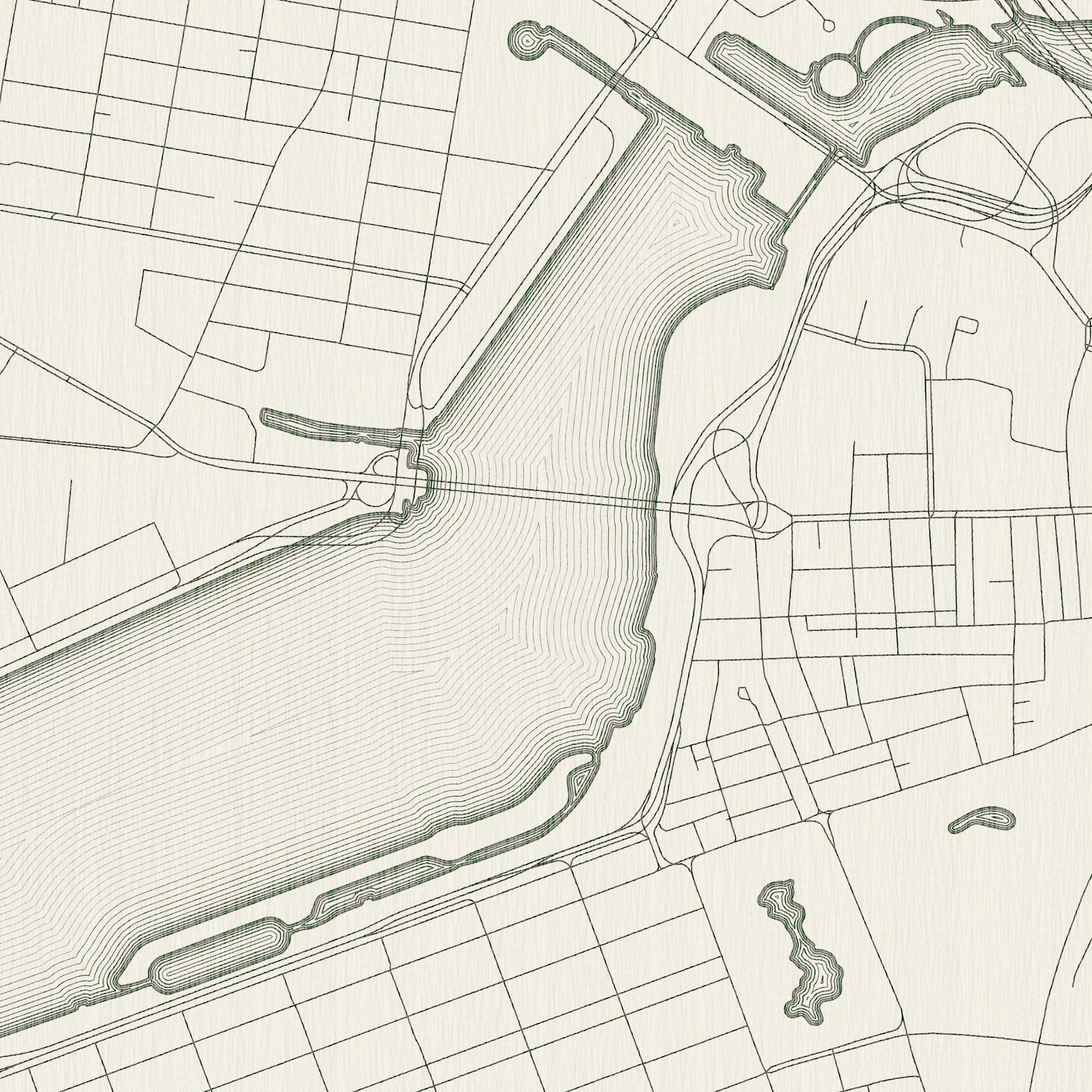
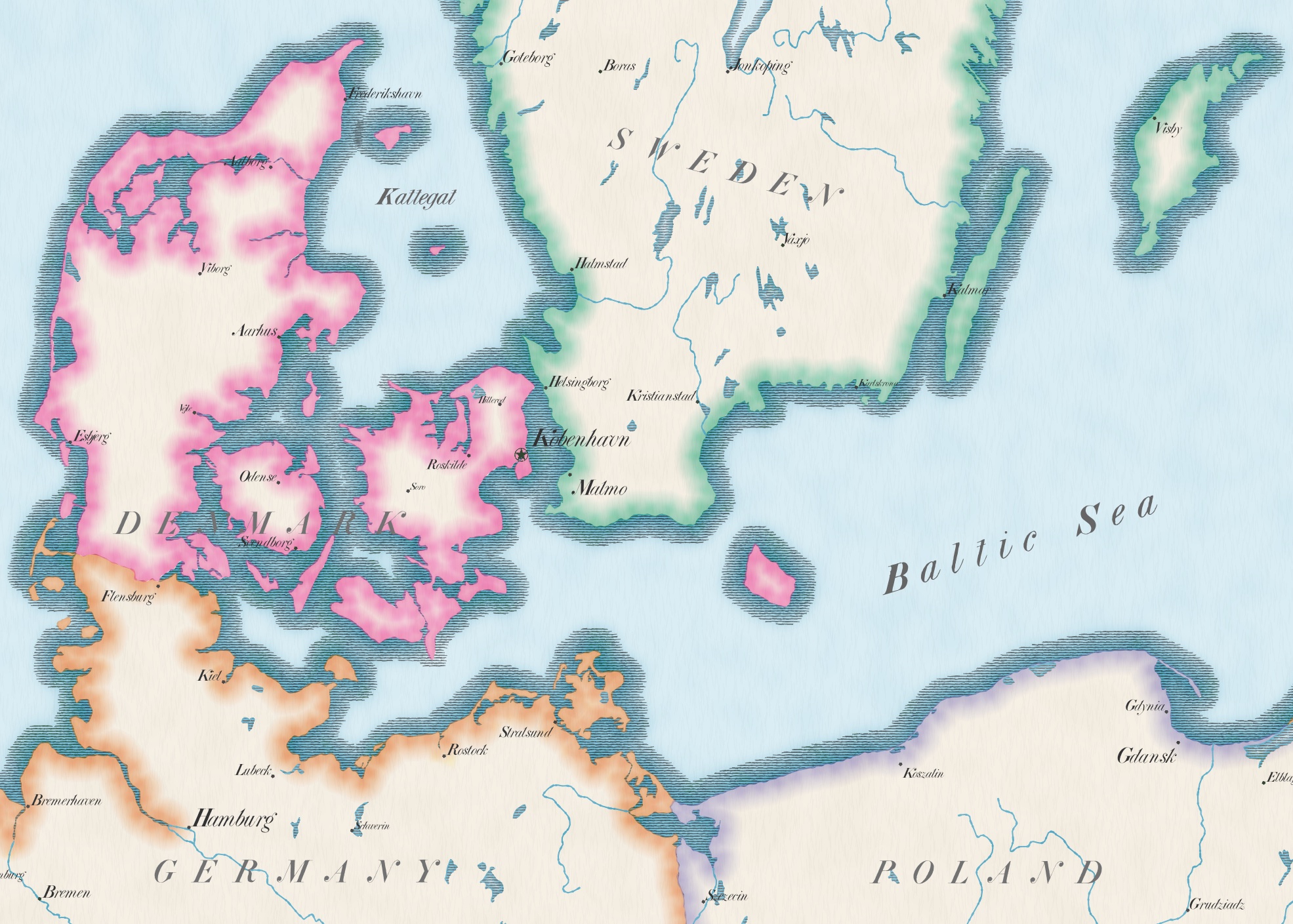
11 and 14. Retro and Europe: Antique map styles with QGIS
This is my favorite cartographic hobby lately: finding digital techniques to mimic pre-digital cartography. (Expect a detailed post with the tips and tricks I've learned some day soon!) My version of "retro" was probably more of a throwback than most people's, and a few days later Europe made me think "old maps" so I did a similar thing. I do intend to explain all the little things some day, but the short explanation of both these maps is this: for hand-drawn looks in QGIS styles, use randomization in almost everything.
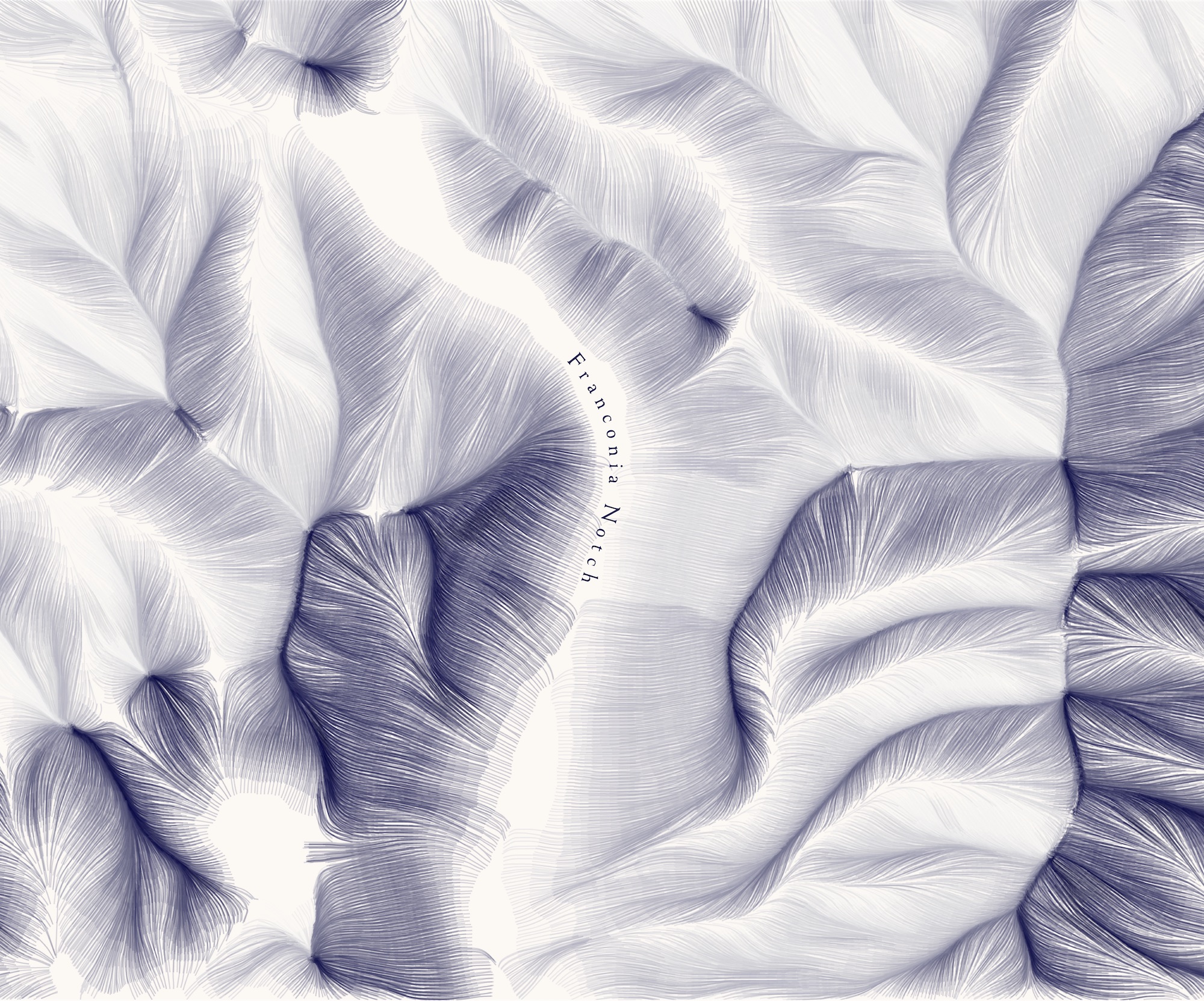
17. Flow: Feathery terrain
This is a style of terrain map that I've been working on and perfecting bit by bit over several years, and since the original idea was to depict the "flow" of the land, this was another lazy/easy day for me. I've written about it before, and have posted many maps like this to social media, but I'm including it in this write-up in part to mention that I have started selling a couple of prints of this style for the White Mountains in New Hampshire!
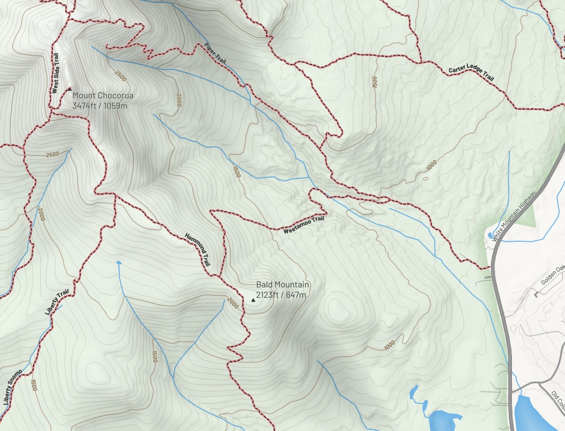
20 and 24. Outdoors and Black and White: A hiking map
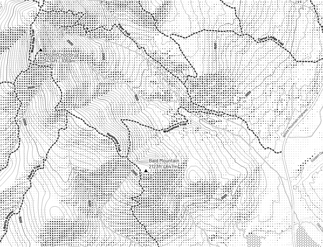
For "outdoors" day I challenged myself to make a decent-looking hiking trail map only within QGIS (no finishing touches allowed in Illustrator or anything). Of course there wasn't time to make a complete map, but I think I made decent enough progress to show that it's possible with QGIS symbology options, etc. For "black and white day" I knew I wanted to interpret the theme strictly: the map would use only black and white, not shades of gray. It turned out I had already set myself up for a cartographic challenge! Converting the trail map to black and white, with its raster hillshade background and reasonably busy vector and text layers, made for a good exercise in finding ways to represent information without relying on color. My attempt shows promise, I think, but its legibility depends on how closely you look.
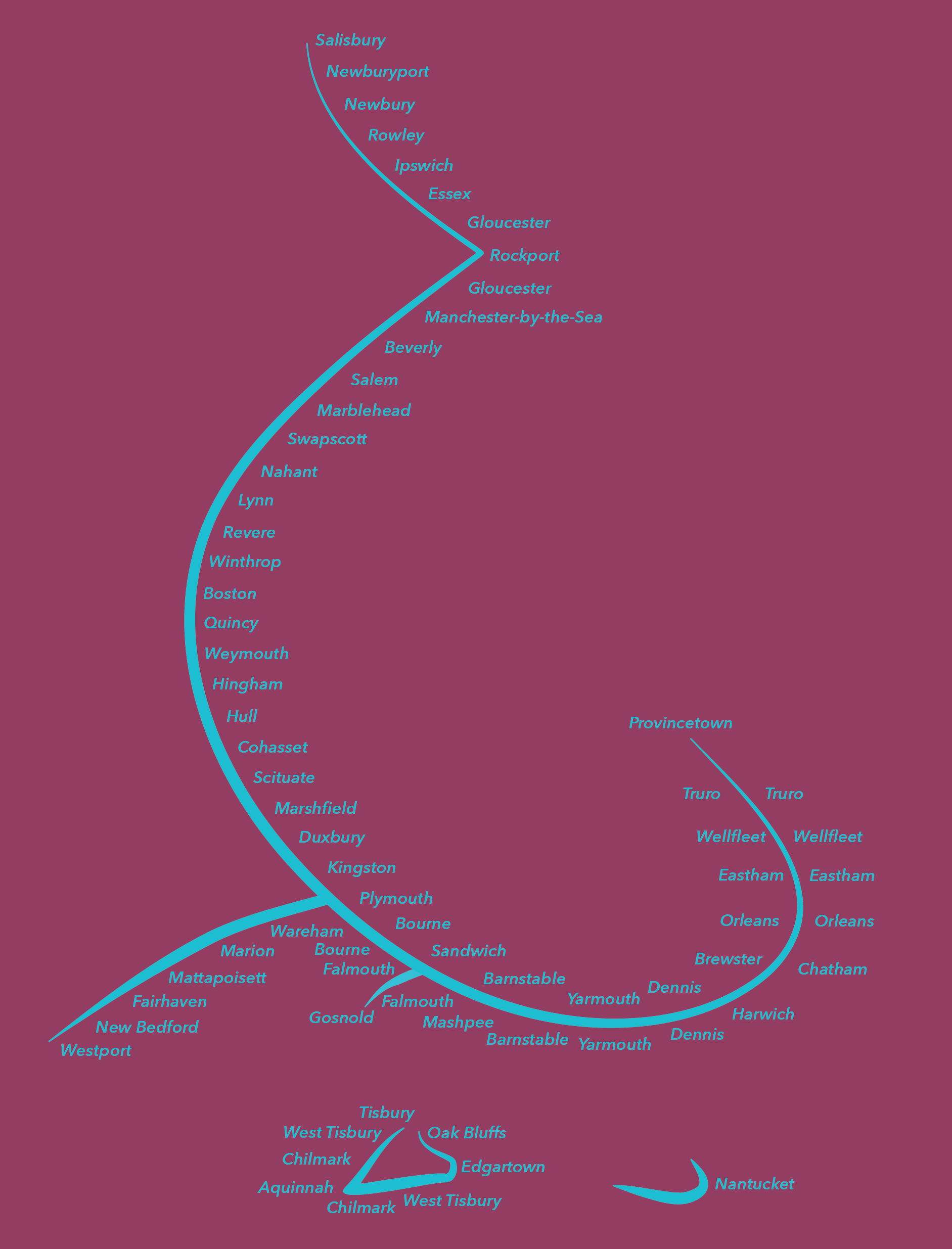
26. Minimal: Coastal towns of Massachusetts
Perhaps the map I'm most proud of, because it best embodies the spirit of the whole challenge, going from initial idea to finished map in perhaps 30 minutes—and it turned out nicely! This map shows the coast of Massachusetts as a generalized, swooping line with a kind of calligraphic stroke. Every city and town that touches the coast is labeled; duplicate labels such as on Cape Cod mean the town has two coastlines. It's kind of elegant and, as a bonus, looks a bit like a fish or shark!
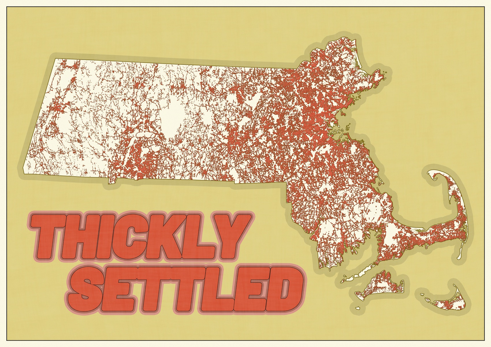
29. Population: Thickly Settled
You know you're in Massachusetts when you see "tickly settled" signs on the street. I've been wanting to make a map celebrating this peculiar phrase, and this is as close as I'll get for the moment. The signs have a particular meaning related to vehicle speed limits in densely built areas. This map is not the actual legal "thickly settled" zones, but it is an approximation of places that meet the building density requirement. (Residential buildings within 200 feet of each other.) I tried to make this look a bit like a post card; nothing says "hello from Massachusetts" quite like "thickly settled"!
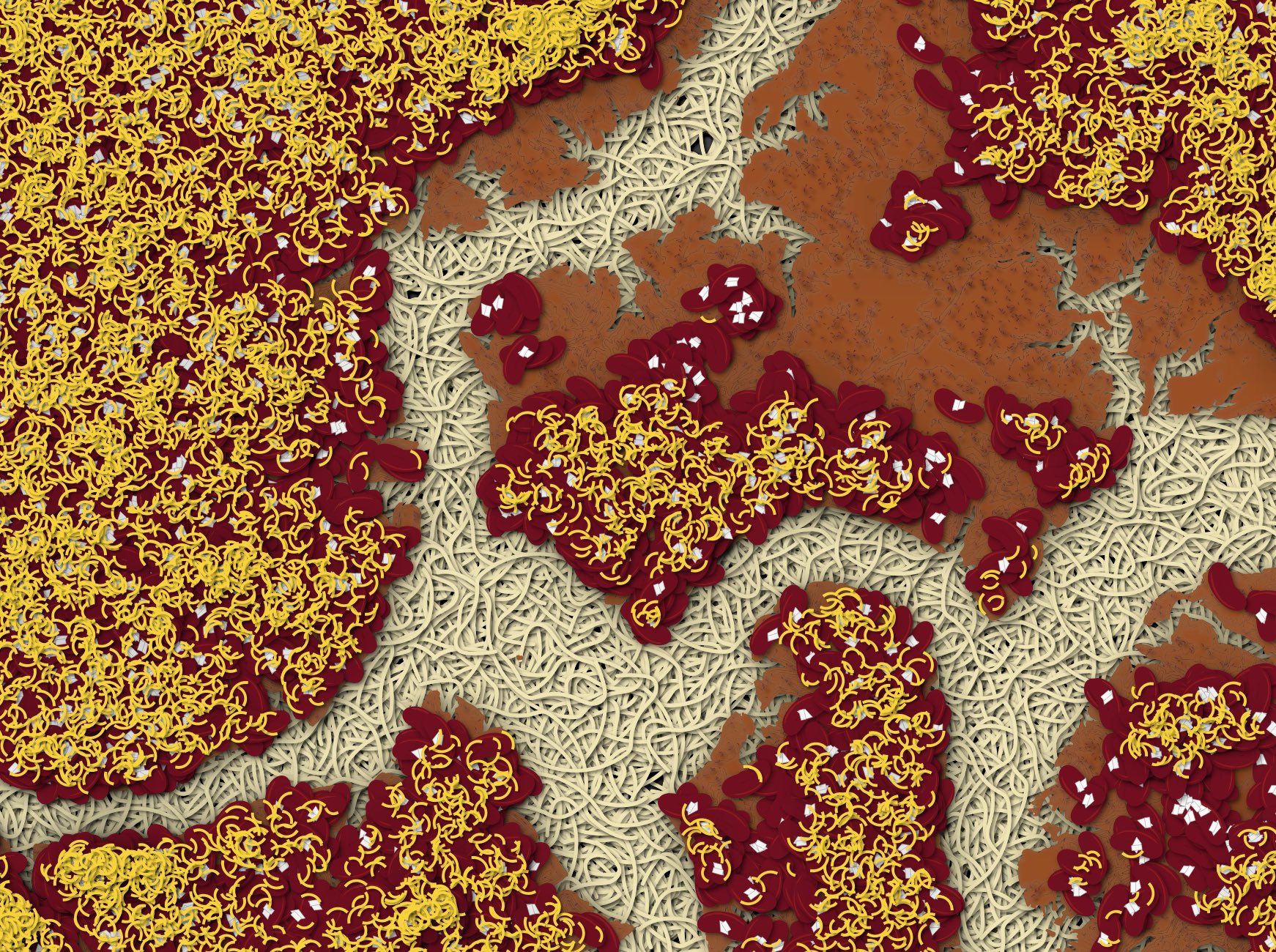
30. "My favorite": Cincinnati chili
Last but not least: for the open-ended "my favorite..." prompt I chose a place that used to be my favorite map subject and a food that remains one of my favorites. Cincinnati chili is a food that divides people. Either you grew up with it and love it, or you have incorrect, bad opinions and think it's absolutely disgusting. I took some elevation ranges of central Cincinnati and with some weird QGIS styles (including my very own custom-made SVG spaghetti strand!) depicted them as the layers of a classic 5-way: spaghetti, chili, beans, onions, and a mountain of shredded cheese.