By Andy Woodruff on 27 July 2009
For the benefit of anyone following along via RSS, just a quick note to say that I have updated the AS3 shapefile loading and drawing helper classes from last week to include basic loading of attributes from a DBF file, again using Edwin van Rijkom’s libraries. I hope it helps a bit more for anyone trying to get started with shapefiles in Flash and ActionScript.
Tagged as3, shapefiles | 1 comment
By Andy Woodruff on 16 July 2009

Recently I’ve heard two friends independently inquire about some sort of basic guide for loading and drawing a shapefile in Flash. The only real tutorial/example I can recall is here, dealing with Google Maps. But these guys are looking for something more bare-bones. Being a regular user of Edwin van Rijkom‘s invaluable code libraries for reading shapefiles, and usually forgetting the process myself, I thought it would be a good idea to put together a very simple set of AS3 classes that load a shapefile and throw a map on screen.
So to get those jerks off my back, I wrote a little thing called ShpMap, which supplements van Rijkom’s classes by loading and drawing a shapefile. It’s nothing fancier than that. Sometimes all you need is to get your base map on screen. (Update: just to round it out a little more, I’ve added basic loading and parsing of a shapefile’s accompanying DBF file, which contains attribute data. This also uses classes by van Rijkom.)
I hope that this class (and the several associated classes) can both be directly usable for some projects and serve as a basic guide to using van Rijkom’s classes to load shapefiles.
Dig it:
- An example that loads and displays a US states shapefile (and then puts a square on my house and colors the state of Wisconsin green). View the source code here.
- Download the source code. (My classes plus van Rijkom’s, as well as a demo US States shapefile.)
Tagged as3, shapefiles | 45 comments
By Andy Woodruff on 9 July 2009
Here is a shout-out to a new blog by Daniel Huffman, an all-star cartographer in the generation succeeding mine at the University of Wisconsin-Madison Cartography Lab.
As I was tearing a path of destruction through Madison last week, Daniel introduced me to his blog Cartastrophe, in which he is doing something that I always wanted to do but never possessed the stones, for fear of retribution: picking apart bad maps. There are many, many bad maps out there on the internet, and he’s going to find them and make fun of them. I know that professional cartographers sound like elitist a-holes for doing things like this, and we probably are, but in criticizing bad maps Daniel is offering suggestions for good map design practices. He is also kind enough to say One Nice Thing about each map.
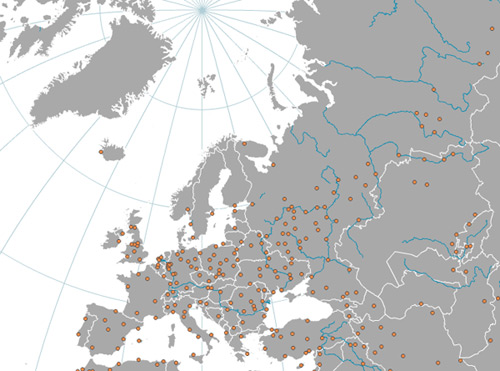
Huffman’s credentials include winning the 2008 National Geographic map award (for his map of Europe’s tallest buildings) and probably other awards I’m forgetting. Secondary shout-out: second prize in that contest went to another UW-Madison Cart Labber and all-around cool guy Ben Coakley for his map of air service in Canada.
| 1 comment
By Andy Woodruff on 1 June 2009
(Update, June 19: How ’bout that? Google has just added a feature that is almost exactly what I was wishing for in this post. Read about it at the Google LatLong blog. At least I got this post out just before that was added, so I don’t look entirely like a fool.)

There’s a lot of information on the internet, if you haven’t noticed. Far too much for any mere human to wade through. And that’s why we find simple beauty in Google. Instead of overwhelming us with links and content, its home page provides a single search field. “Remain calm,” it says in a soothing but vaguely sinister voice, “just tell us what you’re looking for and we’ll bring it to you.” But God help you if you don’t know what you’re looking for.
Okay, it’s not that bad. Research and debate about searching versus browsing behaviors have played out over centuries (assuming that measurement of time in this information age is something akin to dog years), and it seems safe to say that most of the time information can be accessed by either means. Back in the wild days of the 1990s, web usability guru Jakob Nielsen found that “half of all users are search-dominant, about a fifth of the users are link-dominant [browsing], and the rest exhibit mixed behavior” and argued that “[d]espite the primacy of search, webdesign still needs to grounded in a strong sense of structure and navigation support” for the sake of not only those link-dominant users but everyone else too (link). Most of the web seems to adhere to that principle, but it’s a search-based world out there.
And I kind of hate it.
Sure, it’s obviously crucial to be able to search for what I’m looking for, but I’m not always looking for anything in particular. I want to explore or, to frame it (perhaps more accurately) in terms of mental lethargy, to avoid having to think of something to look for. It’s like Christmas shopping for all my relatives: as torturous as it already is, if I weren’t able to browse store shelves and instead had to think of specific gifts to ask the shopkeeper for, I’d probably collapse and bust into tears. (I titled this post after Steve Krug’s wonderful “common sense” book on web usability Don’t Make Me Think, not that I’m quite what he was talking about.) It bugs the hell out of me whenever I go to check out the newest Coolest Web Tool or Visualization Ever, only to find that I must think of something to search for in order to see it in action.
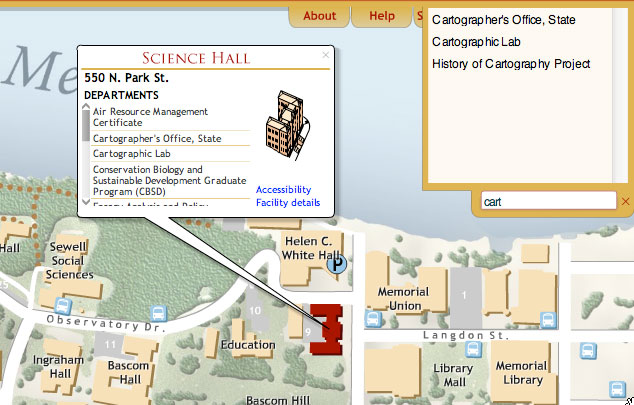
So it goes especially with maps. Obviously I speak from the perspective of a hardcore map nerd, but for me a map is something to experience and explore, not simply a canvas on which facts are presented. In any cartography work I’ve been a part of, we have tried to ensure that information can be attained either directly by search or by browsing the map. Consider the University of Wisconsin-Madison campus map, for instance. The same information is visible via both the search box and clicking things on the map.

That’s great for single-purpose, limited-scope maps where all the data can pretty easily be organized within view. What about maps that contain massive amounts of data of every conceivable sort, such as Google Maps? These maps justifiably revolve around searching. But ideally they’d be able to answer not only the question “where is X?” but also “what is here?”.
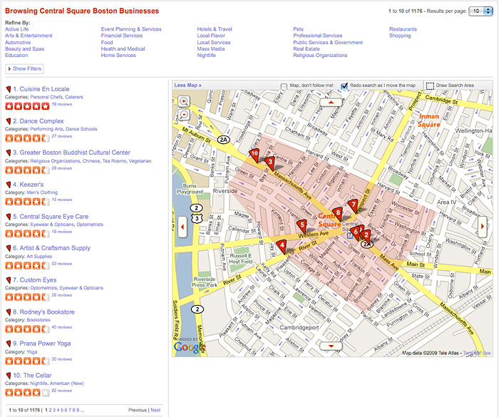
The easy solution is of course to just list every data point within certain location bounds, either the current map view or a specific chosen area. I find Yelp to be a good example of a site that has a lot of data and offers a way to browse it all via map. I can click on my local neighborhood and thumb through all 1175 businesses therein, filtering as desired.

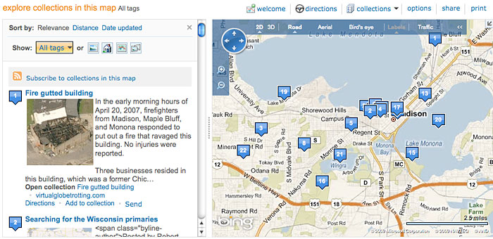
Google et al. offer some similar capabilities, suggesting some categories of data to explore within the extent of the map you’re looking at, particularly user-generated content. Google has its photo, video, and Wikipedia layers. Microsoft provides categories in its sidebar and lets you explore user “collections.”

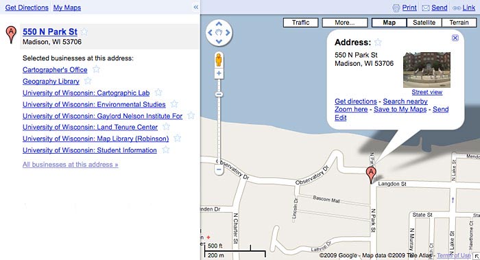
Those options are useful, but they still don’t allow you to get at everything. They’re using the normal top-down browsing approach in which results are refined by category; in this case location is like another category. What I think would be an interesting addition is a bottom-up approach, where all available data are presented, but only within very short range of a specified point. Google has a start at this. After searching for an address, a list of businesses at that address is provided.

This kind of thing is a pretty useful way of exploring a place, I think. Say you were thinking of moving into an apartment and wanted to find out what’s on the same block. You could zoom in very close and tirelessly search for every category you can think of, but wouldn’t it be great to be able to just click once and be shown everything that’s on the block? I’d bet that in most cases the amount of information returned for such an extent would be manageable.
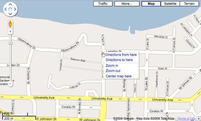
There are a couple of ways in which the Google Maps browsing approach would be improved in my eyes. First, don’t make me search! It would be helpful to be able to click the map and find out what I clicked on. In addition to Google’s current right-click menu (“Directions to here”? Where the F is “here”?)…

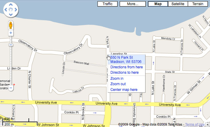
…simply do a reverse geocode on the click location and give me the street address if possible. (As one who often uses Google Maps just for reference, this would be immensely useful in general.) Clicking on that would be the same as having searched for the address, as in the screenshot before last.

Second, in addition to the “All businesses at this address” link that appears in the results for a specific address, a “Businesses near this address” link would allow the user to explore beyond the single point while limiting the volume of data to a reasonable level, assuming a small enough radius like one city block. Obviously the amount of data depends on the density of the place, but I’d guess that most of the time it wouldn’t be overwhelming if it were grouped by address.

In my master’s thesis work, one way of describing online map reading was a continuum from map as tool to map as answer, where on one end the user interacts with and explores the map to eventually arrive at some end goal, and on the other end the user asks the map a question and is given the answer. The major online map services lean toward map as answer. But me, well, as people are always telling me, I’m a total tool.
Tagged interactive maps, map browsing, online maps, search | 2 comments
By Andy Woodruff on 26 May 2009
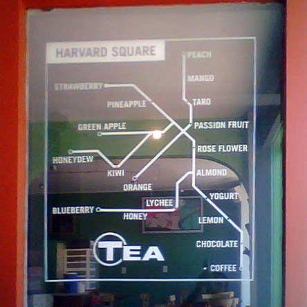
Forgive the crummy phone picture.

Having been on a subway map kick for a while, and having yesterday fallen victim to an odd smoothie craving, it seemed right to snap this picture and post it here. This is the window of Boston Tea Stop in Harvard Square in Cambridge, Massachusetts. It’s wordplay, see? You know you love it. (For those who don’t know, the transit system in Boston is commonly known as the “T” and is signified by the letter T in a circle, much like in “Tea” above.)
There’s not much to say about this, but it’s always nice to see interesting uses of maps. Here they’ve arranged their flavors on a map of most of Boston’s rapid transit lines. There appears to be some attempt to adhere to the color designations of the actual subway lines: for example, strawberry is at the end of the Red Line, green apple is at the end of one of the Green Line branches, and orange is at the end of (naturally) the Orange Line. But otherwise there doesn’t seem to be any meaning to the arrangement of flavors or topology, which makes this only a kind of cool map rather than a totally awesome map.
I chose passion fruit, by the way, which is the real-life equivalent of the State station on the Orange (and Blue) Line. I’ve yet to use that station to see if it is as tasty and contains as many balls of tapioca.
Tagged interesting maps, metro maps | Comments Off on Next stop deliciousness. Doors will open on both sides.
By Andy Woodruff on 12 May 2009

At Axis Maps, in our march toward indiemapper, we have made indieprojector, a tool for creating projected maps of your geographic data and exporting them to vector graphics for further design work. Part useful tool and part demo of indiemapper functionality, indieprojector fulfills one of the cartographer’s most basic requirements. In my experience trying to make maps on my home computer without complicated or expensive GIS, not being able to start a map by projecting my data has always been the most frustrating barrier, as the prior (finding data) and subsequent (graphics editing) steps can easily be accomplished. We hope that indieprojector can help out.
We’ve started with eleven global and continental projections to choose from, support for most shapefiles and KML, and export to SVG. Give it a try!
Tagged axis maps, indiemapper, projections | 1 comment


